
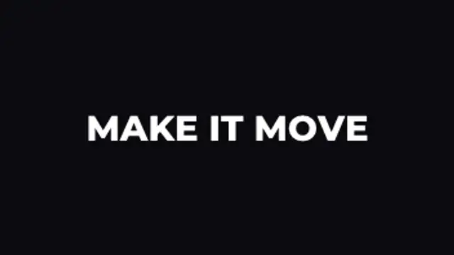
Words rise into place one after another with a soft fade, then lift away. Perfect for captions and hooks.
Kinetic typography presets for any word, headline or caption.
Words rise into place one after another with a soft fade, then lift away. Perfect for captions and hooks.
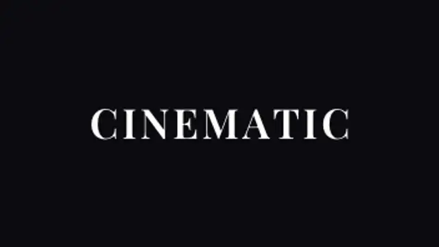
Letters sharpen out of a dreamy blur from the center outward for elegant, cinematic titles.
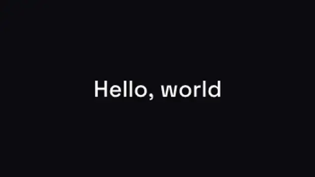
Classic typing effect with a blinking cursor that writes your message and erases it again.
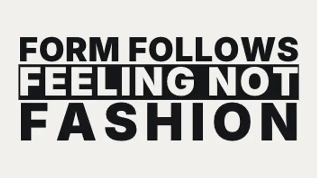
Each line is scaled and tracked until it sits flush with both edges of the measure, so a two-word line and a five-word line carry wildly different weight.

Each line glides up from behind an invisible mask while an accent bar draws underneath. Editorial and bold.

Letters drift together from wide spacing while fading in, the signature look of luxury and fashion brands.
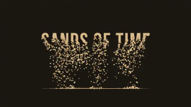
Your title drains away from the bottom up, grain by grain, and the sand falls and piles into a real heap that slumps at its natural angle.
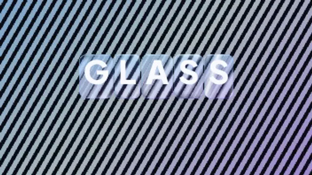
Every letter arrives inside its own rounded glass slab that bends and offsets the pattern behind it, with bright edge caustics and a specular highlight sweeping across the whole word.
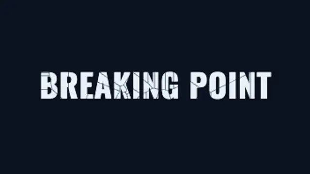
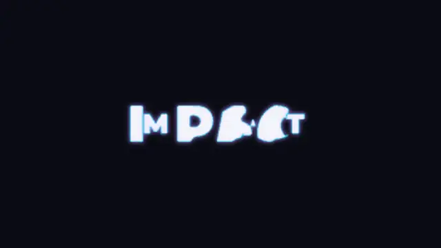
An impact flashes on your title, cracks race out across the letters, then the glass breaks into real shards that tumble and fall away.
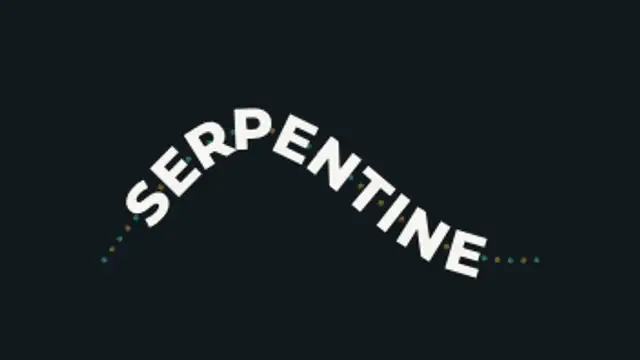
Oversized lettering rides an S-curve that pulls taut and springs back, every letter re-solving its position and tilt as the path deforms.
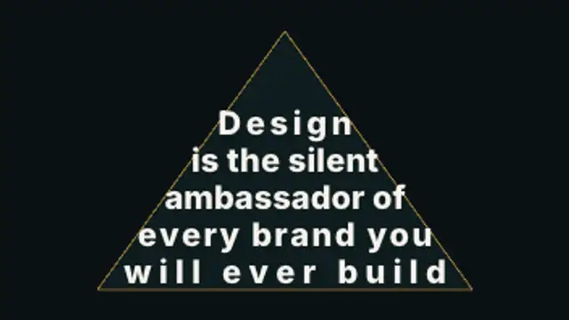
A paragraph pours itself into a silhouette, rewrapping and resizing line by line so the type itself becomes the shape, then reveals row by row.

Your word is repeated once per band, every copy sliding at its own rate behind its own slice, until all of them land in register for a single legible instant and shear apart again.
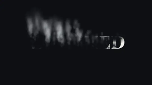
Soft holes eat through your title as it burns away into curling smoke that rises, sways and thins out into the air.
One shared word stays pinned in place while the rest of the line cuts away and reforms around it, so the whole chain reads as a single moving object.
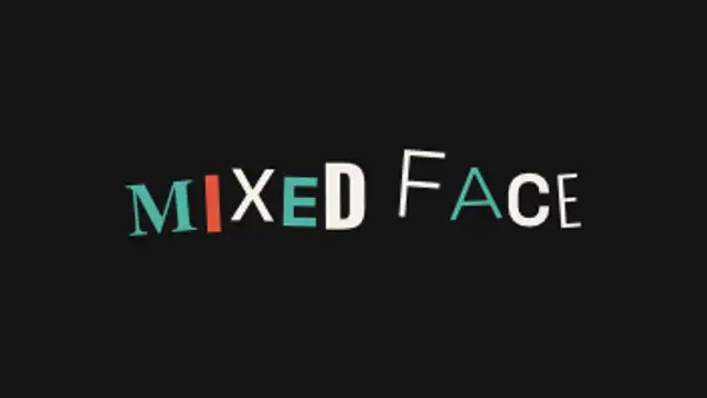
Every letter independently shuffles through different typefaces, weights, sizes and baselines on twos, re-laying out the whole line each step, until the shuffle thins out and the words land on one clean setting.
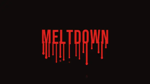
Your letters soften and sag while thick drips run from their bottom edges, swell into heavy tips and let the odd drop fall away.
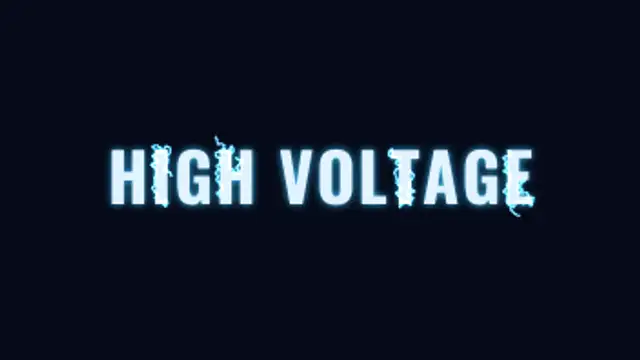
Electric arcs crawl and flicker along the real outlines of your letters, forking as the charge builds, until the title flashes fully on.

Letters glide together until their outlines bridge with a concave fillet and fuse into one liquid mass, then neck and snap apart as they separate.
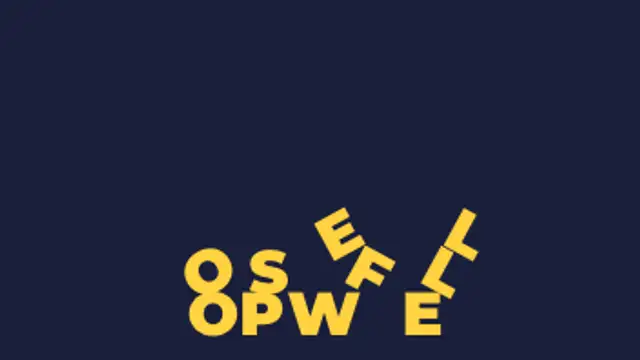
Each letter loses its footing in turn, drops, bounces and tumbles, then settles on the floor or on the letters that landed before it.
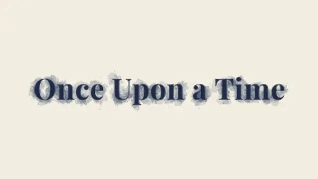
Drops of ink land inside your letters and wick outward into the paper, feathering along fibres with darker rims until the title settles in.
Layered banks of fog drift across the frame, part to either side to reveal your title in the clearing, then roll back in and swallow it again.
Hexagonal ice crystals branch across your letters from seeded points, the title chills to a frosted blue and tiny glints twinkle once it is frozen solid.
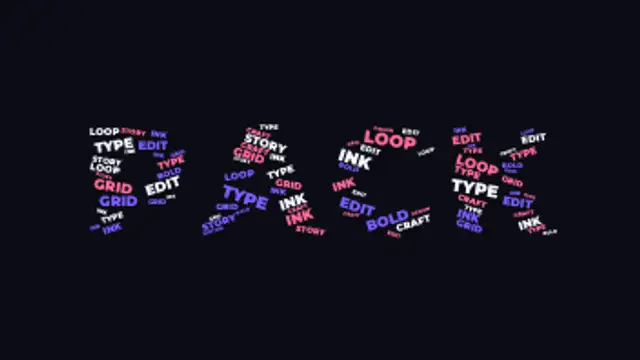
A giant headline word is packed full of dozens of smaller words measured to fit its letterforms exactly, then the whole crowd scatters apart and flies back in.
Your first word breaks into thousands of dots that sweep along curved paths and re-form as your second word. Put each word on its own line.
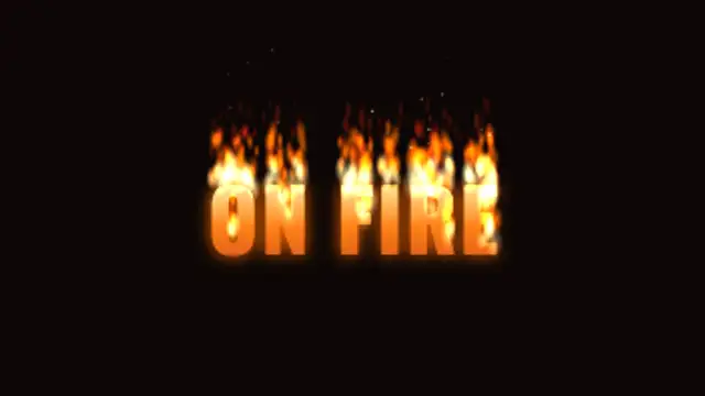
Flames catch along the tops of your letters and keep burning, licking upward in layered tongues while the letters glow hot and embers drift away.
Your first word's letterforms stretch and flow directly into the second word's, contour by contour, with spare shapes growing in or collapsing away. Put each word on its own line.
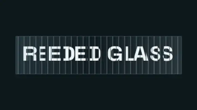
Your headline sits behind vertical fluted glass: every rib magnifies and slides its own slice of the letterforms, so the type scrambles into ribbons as the glass sweeps past and snaps back to perfectly readable.
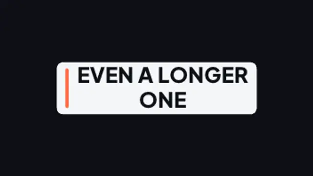
A container measures every headline and springs to hug it exactly, re-flowing wider, narrower or taller as the wording changes.
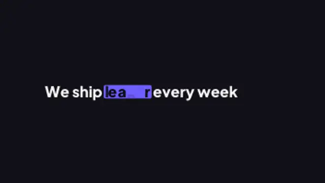
A sentence keeps one live slot word: as it swaps, the highlight marker stretches to the new word's width, the rest of the line reflows around it and letters the two words share glide to their new place.
Two words made of the same letters trade places: each letterform travels to its new position and reshapes on the way, so one phrase becomes the other without a cut.
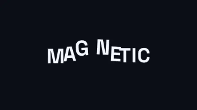
An invisible magnet sweeps through the headline and every letter flees it, dragging its neighbours along on an elastic chain before the whole line springs back into place.
Raindrops land on the glass in front of your blurred title and each one refracts the words, flipped and magnified, before some slide away leaving wet trails.
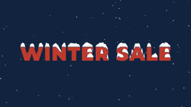
Snow drifts down past your title and the flakes that land build soft rounded caps along the top of every letter until it looks freshly snowed on.
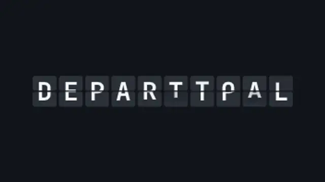
Every letter rattles through the alphabet on hinged cards and lands on your text, column by column, like an airport departure board.
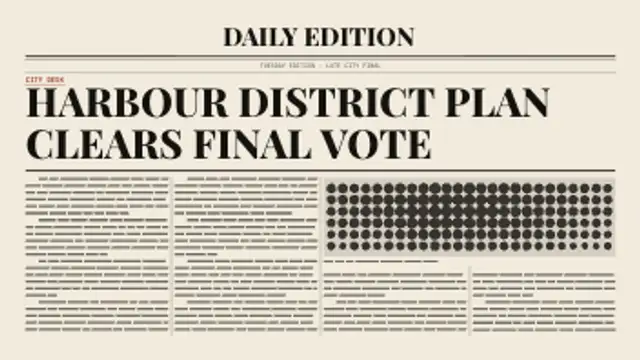
A newspaper page builds itself around your headline: rules draw on, the headline sets line by line, then greeked columns flow around a halftone photo block.
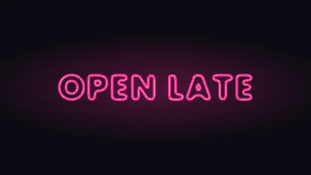
Glass neon tubes bent along your letter outlines stutter to life one by one, glowing onto the wall behind, with one tube that keeps buzzing.
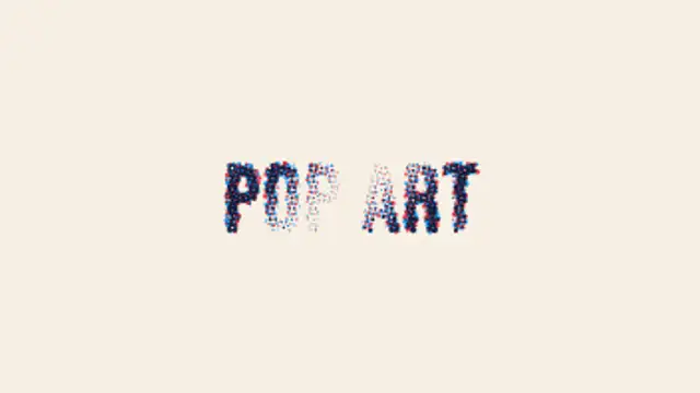
Your title is printed as two offset halftone screens of dots that sweep in, then swell and shrink in a travelling wave like pulsing pop art ink.
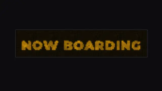
Your title is rebuilt as dots on an LED sign board: a hot scan column wipes across, pixels flicker as they catch, then glow with a slow shimmer.
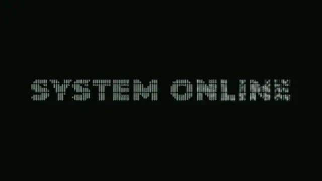
Your title is rebuilt from a grid of ASCII characters that flicker through random symbols, then lock into dense marks that trace the real letter shapes.
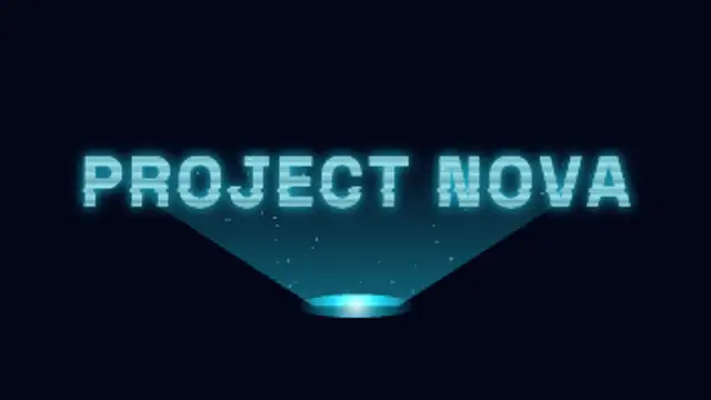
A projector beam builds your title band by band from the bottom up, with rolling scanlines, glitching slices, flicker and motes drifting through the light.
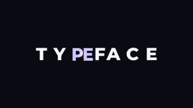
Letters slide together until their real letterform edges touch, compress against each other, then spring out to their final spacing.
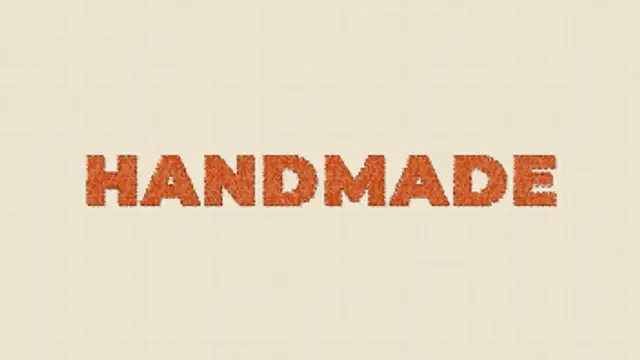
A needle sews your title into linen stitch by stitch, filling each letter with shaded satin thread before a running stitch traces the outline.
Your text flies in fast and shears, stretches and smears in exact proportion to its own velocity, then snaps back on a spring that overshoots and settles.
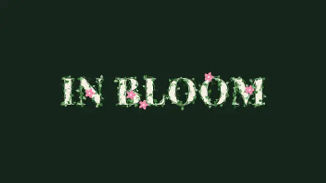
Vines creep along the outline of every letter, leaves bud one after another and curling tendrils spring out, then small flowers open at the tips.
Pick a text preset, type your line, choose a font and weight, then set the colors, easing and duration. The preview renders the real animation, and the export is an MP4 or a transparent WebM you drop straight onto a track in your editor.
Kinetic typography carries a message faster than a voiceover. These presets stagger words, blur them in, type them out or mask them behind a line, and every one of them takes your own copy and your own font.
Read the full guide: How to Animate Text in a Video44 editable presets, including Word Slide Up, Character Blur Reveal, Typewriter, Justified Stretch Stack, Line Mask Reveal and Tracking Expand. Every one opens in the browser editor, where you change colors, timing and any text before you download.
1 of the 44 loop seamlessly, including Reeded Glass Sweep. The rest play once from start to finish.
MP4 for any editor or platform, WebM with a transparent background for the web, and a PNG sequence with alpha for Premiere Pro, After Effects, DaVinci Resolve and Figma. Every preset exports in 16:9, 9:16, 1:1 and 4:5 from 720p up to 8K, with a commercial license in your name.
Editing and previewing are free. You only spend a credit when the finished file lands on your machine.
5 free HD downloads on a new account · No card required