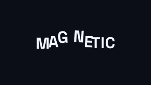
An invisible magnet sweeps through the headline and every letter flees it, dragging its neighbours along on an elastic chain before the whole line springs back into place.
Serpentine Path Type
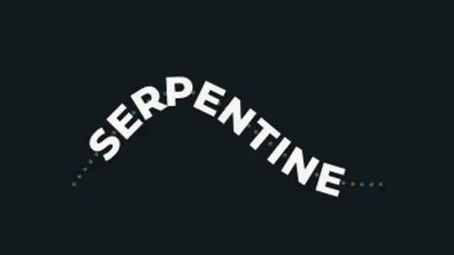
Oversized lettering rides an S-curve that pulls taut and springs back, every letter re-solving its position and tilt as the path deforms.
Oversized type flows along an S-curve that pulls taut and springs back, so letters re-solve spacing and tilt every frame. Edit text, font, colors, export MP4.
Part of Text Animations. New to this kind of graphic? Read How to Animate Text in a Video.
Transparent exports and editor imports are explained in the transparent video guide, and every download is free under the commercial license.
Content: text. Typography: font, weight, size and letter spacing. Style: background, text color, primary and accent. Layout: aspect ratio. Motion: duration, easing and variation.
Serpentine Path Type runs 4.6 seconds by default, and you can set any length up to 15 seconds before you export. It plays once.
Use Serpentine Path Type for a festival name on a poster-style opener, a song title in a lyric video or a playful brand word in a social advert. The curve tightens and relaxes, so the lettering keeps moving while staying readable.
An invisible magnet sweeps through the headline and every letter flees it, dragging its neighbours along on an elastic chain before the whole line springs back into place.
One shared word stays pinned in place while the rest of the line cuts away and reforms around it, so the whole chain reads as a single moving object.

A container measures every headline and springs to hug it exactly, re-flowing wider, narrower or taller as the wording changes.
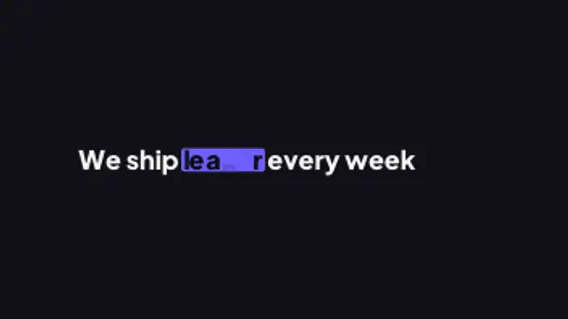
A sentence keeps one live slot word: as it swaps, the highlight marker stretches to the new word's width, the rest of the line reflows around it and letters the two words share glide to their new place.
Your text flies in fast and shears, stretches and smears in exact proportion to its own velocity, then snaps back on a spring that overshoots and settles.
Two words made of the same letters trade places: each letterform travels to its new position and reshapes on the way, so one phrase becomes the other without a cut.
Your title is rebuilt from a grid of ASCII characters that flicker through random symbols, then lock into dense marks that trace the real letter shapes.
Letters sharpen out of a dreamy blur from the center outward for elegant, cinematic titles.