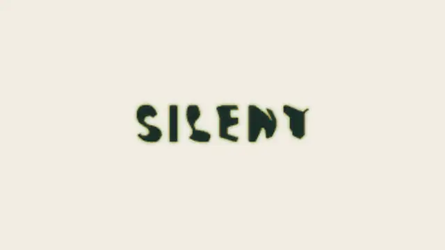
Two words made of the same letters trade places: each letterform travels to its new position and reshapes on the way, so one phrase becomes the other without a cut.
Character Blur Reveal
Letters sharpen out of a dreamy blur from the center outward for elegant, cinematic titles.
Part of Text Animations. New to this kind of graphic? Read How to Animate Text in a Video.
Letters sharpen out of a dreamy blur from the center outward for elegant, cinematic titles. It belongs to the Text Animations category on velements, where you edit it in the browser and download it as a finished video file.
Every control in the editor, grouped the same way there. Content: text. Typography: font, weight, size, letter spacing, line height and align. Style: background and text color. Layout: aspect ratio. Motion: duration, easing and variation. Each change appears in the live preview straight away, and editing is free.
Character Blur Reveal runs 2 seconds by default, and you can set any length up to 15 seconds before you export. It plays once from start to finish, so it drops straight onto a cut or an opening.
Yes. Set the background to Transparent, then export a PNG sequence for Premiere Pro, After Effects, DaVinci Resolve, Final Cut Pro or Figma: import the first frame as an image sequence and it drops onto a track above your footage with a straight alpha channel. Export WebM with a VP9 alpha channel for the web and for CapCut. MP4 has no alpha channel, so it keeps a solid color or image behind the animation.
Yes. Each download comes with a perpetual commercial license in your name for client work, ads and products, and you may sell the edited clip on stock footage sites. Reselling the preset itself as an editable template is not allowed.
Two words made of the same letters trade places: each letterform travels to its new position and reshapes on the way, so one phrase becomes the other without a cut.
Letters slide together until their real letterform edges touch, compress against each other, then spring out to their final spacing.
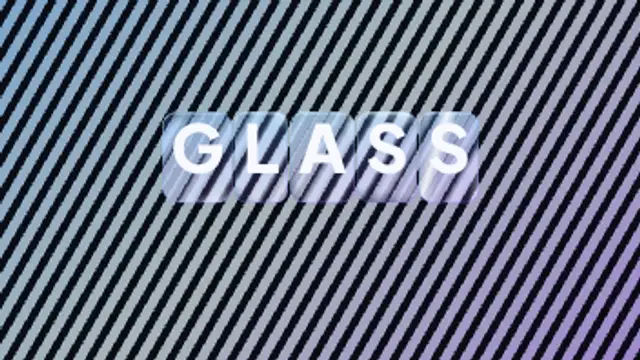
Every letter arrives inside its own rounded glass slab that bends and offsets the pattern behind it, with bright edge caustics and a specular highlight sweeping across the whole word.
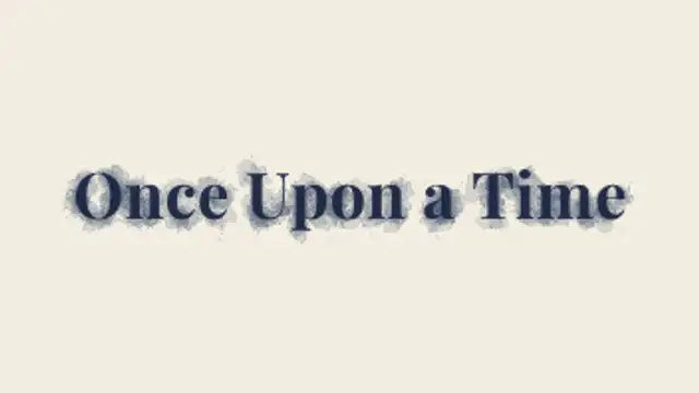
Drops of ink land inside your letters and wick outward into the paper, feathering along fibres with darker rims until the title settles in.
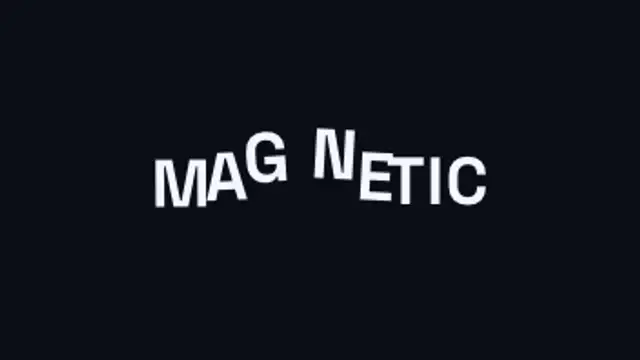
An invisible magnet sweeps through the headline and every letter flees it, dragging its neighbours along on an elastic chain before the whole line springs back into place.
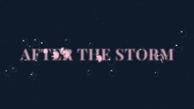
Raindrops land on the glass in front of your blurred title and each one refracts the words, flipped and magnified, before some slide away leaving wet trails.
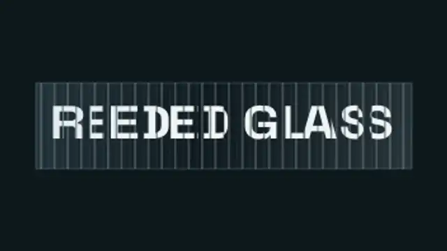
Your headline sits behind vertical fluted glass: every rib magnifies and slides its own slice of the letterforms, so the type scrambles into ribbons as the glass sweeps past and snaps back to perfectly readable.
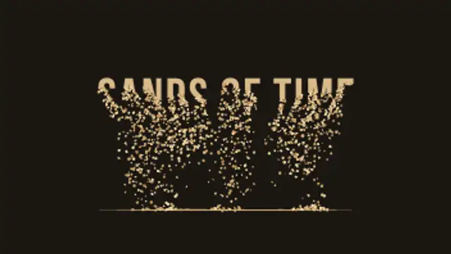
Your title drains away from the bottom up, grain by grain, and the sand falls and piles into a real heap that slumps at its natural angle.