Two words made of the same letters trade places: each letterform travels to its new position and reshapes on the way, so one phrase becomes the other without a cut.
Collision Kerning
Letters slide together until their real letterform edges touch, compress against each other, then spring out to their final spacing.
Letters slide together until their shapes actually touch, squash on impact, then spring into place. Type your text, pick a font and export in 4K.
Part of Text Animations. New to this kind of graphic? Read How to Animate Text in a Video.
Transparent exports and editor imports are explained in the transparent video guide, and every download is free under the commercial license.
Content: text. Typography: font, weight, size, letter spacing, line height and align. Style: background, text color, primary, secondary and accent. Layout: aspect ratio. Motion: duration, easing and variation.
Collision Kerning runs 2.6 seconds by default, and you can set any length up to 15 seconds before you export. It plays once.
Use Collision Kerning for a typography tutorial title, a design agency sting or a one-word logo reveal. Letters bump into each other and spring apart, a short physical gag that suits a fast intro of two or three seconds.
Two words made of the same letters trade places: each letterform travels to its new position and reshapes on the way, so one phrase becomes the other without a cut.

Letters sharpen out of a dreamy blur from the center outward for elegant, cinematic titles.
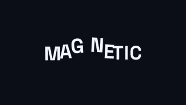
An invisible magnet sweeps through the headline and every letter flees it, dragging its neighbours along on an elastic chain before the whole line springs back into place.
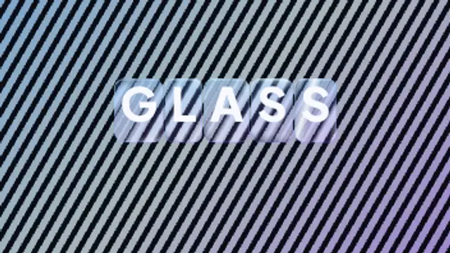
Every letter arrives inside its own rounded glass slab that bends and offsets the pattern behind it, with bright edge caustics and a specular highlight sweeping across the whole word.
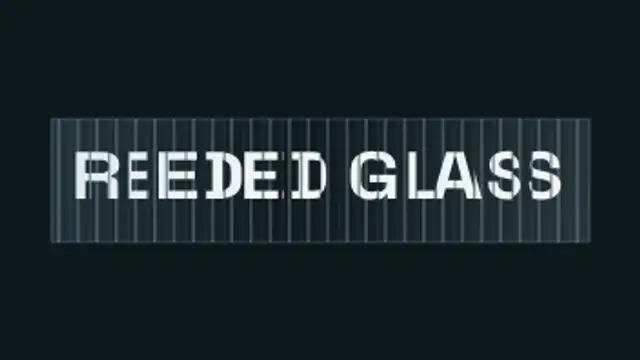
Your headline sits behind vertical fluted glass: every rib magnifies and slides its own slice of the letterforms, so the type scrambles into ribbons as the glass sweeps past and snaps back to perfectly readable.

A container measures every headline and springs to hug it exactly, re-flowing wider, narrower or taller as the wording changes.

Your word is repeated once per band, every copy sliding at its own rate behind its own slice, until all of them land in register for a single legible instant and shear apart again.
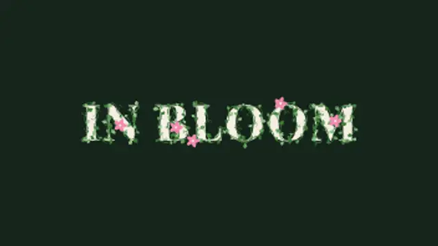
Vines creep along the outline of every letter, leaves bud one after another and curling tendrils spring out, then small flowers open at the tips.