Letters sharpen out of a dreamy blur from the center outward for elegant, cinematic titles.
Ink Bleed Text
Drops of ink land inside your letters and wick outward into the paper, feathering along fibres with darker rims until the title settles in.
Ink drops land in your letters and wick into the paper with feathered fibres and dark rims. Type your title, pick the ink color and export.
Part of Text Animations. New to this kind of graphic? Read How to Animate Text in a Video.
Transparent exports and editor imports are explained in the transparent video guide, and every download is free under the commercial license.
Content: text. Typography: font, weight, size, letter spacing, line height and align. Style: background, text color, primary, secondary and accent. Layout: aspect ratio. Motion: duration, easing and variation.
Ink Bleed Text runs 5 seconds by default, and you can set any length up to 15 seconds before you export. It plays once.
Use Ink Bleed Text for the title of a storybook adaptation, a calligraphy channel intro or a quote from a historical letter. The ink spreads into the paper before the word settles, which suits anything written by hand.
Letters sharpen out of a dreamy blur from the center outward for elegant, cinematic titles.
Two initials drift in from opposite sides and settle either side of an ampersand while a ring draws around them and petals bloom behind.

A line opens from the center while the name rises above it and the title drops below. Balanced and elegant.
Two words made of the same letters trade places: each letterform travels to its new position and reshapes on the way, so one phrase becomes the other without a cut.
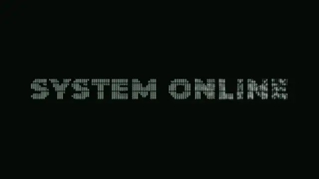
Your title is rebuilt from a grid of ASCII characters that flicker through random symbols, then lock into dense marks that trace the real letter shapes.
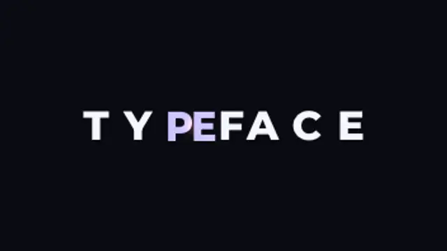
Letters slide together until their real letterform edges touch, compress against each other, then spring out to their final spacing.
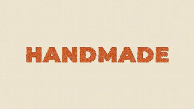
A needle sews your title into linen stitch by stitch, filling each letter with shaded satin thread before a running stitch traces the outline.
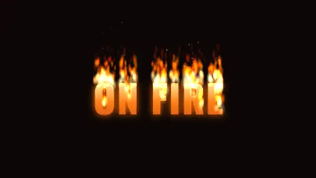
Flames catch along the tops of your letters and keep burning, licking upward in layered tongues while the letters glow hot and embers drift away.