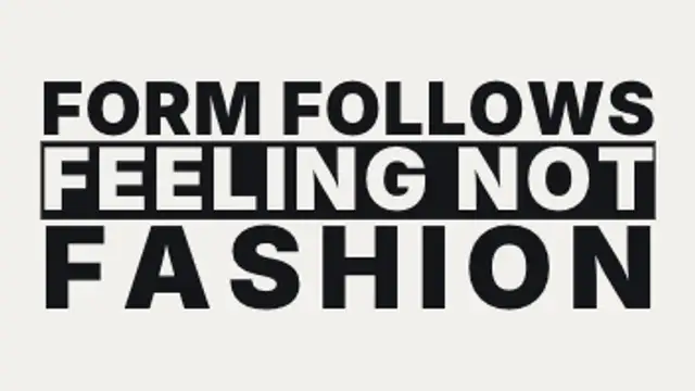
Each line is scaled and tracked until it sits flush with both edges of the measure, so a two-word line and a five-word line carry wildly different weight.
Mixed Face Shuffle
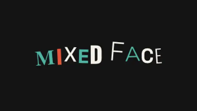
Every letter independently shuffles through different typefaces, weights, sizes and baselines on twos, re-laying out the whole line each step, until the shuffle thins out and the words land on one clean setting.
Letters shuffle through different typefaces, weights and sizes on twos, re-laying the line each step, then land on one clean face. Type your text and export.
Part of Text Animations. New to this kind of graphic? Read How to Animate Text in a Video.
Transparent exports and editor imports are explained in the transparent video guide, and every download is free under the commercial license.
Content: text. Typography: font, weight, size and letter spacing. Style: background, text color, primary and accent. Layout: aspect ratio. Motion: duration, easing and variation.
Mixed Face Shuffle runs 3 seconds by default, and you can set any length up to 15 seconds before you export. It plays once.
Use Mixed Face Shuffle for a type foundry promo, a design school open-day reel or a title that should feel undecided before it commits. The line keeps re-laying itself in different faces, then settles on your chosen one.
Each line is scaled and tracked until it sits flush with both edges of the measure, so a two-word line and a five-word line carry wildly different weight.

Each line glides up from behind an invisible mask while an accent bar draws underneath. Editorial and bold.
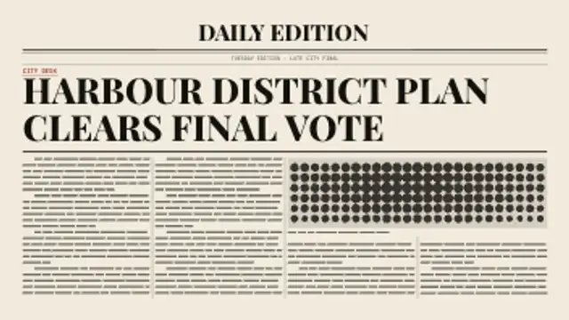
A newspaper page builds itself around your headline: rules draw on, the headline sets line by line, then greeked columns flow around a halftone photo block.
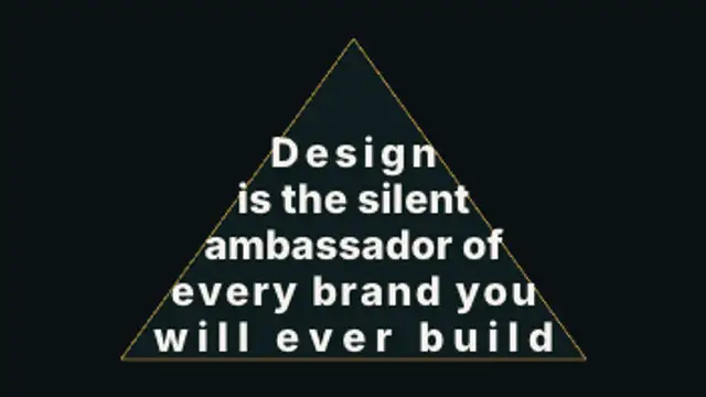
A paragraph pours itself into a silhouette, rewrapping and resizing line by line so the type itself becomes the shape, then reveals row by row.
Two words made of the same letters trade places: each letterform travels to its new position and reshapes on the way, so one phrase becomes the other without a cut.
Your title is rebuilt from a grid of ASCII characters that flicker through random symbols, then lock into dense marks that trace the real letter shapes.
Letters sharpen out of a dreamy blur from the center outward for elegant, cinematic titles.
Letters slide together until their real letterform edges touch, compress against each other, then spring out to their final spacing.