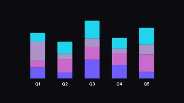
Columns fill bottom to top in stacked segments, showing composition across categories. Type your own data.
Treemap Chart
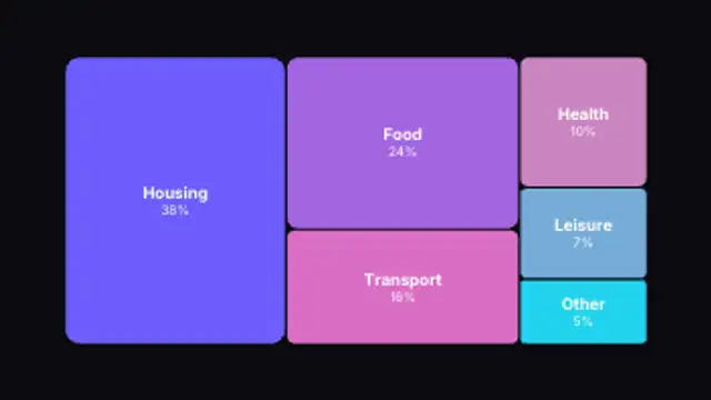
Nested rectangles sized by value tile into the frame to show part-to-whole breakdowns. Type your own data.
Animate a treemap of nested rectangles sized by value for budgets, market share and portfolio breakdowns. Edit your data.
Part of Animated Infographics. New to this kind of graphic? Read How to Animate a Chart for a Video.
Transparent exports and editor imports are explained in the transparent video guide, and every download is free under the commercial license.
Content: values, labels and suffix. Typography: font. Style: background, text color, primary, secondary and accent. Layout: aspect ratio. Motion: duration and easing.
Treemap Chart runs 3 seconds by default, and you can set any length up to 15 seconds before you export. It plays once.
Treemap Chart is a strong choice when a household budget, a cost breakdown or a revenue mix has one or two dominant items. Rectangles tiling into the frame make the biggest share physically the biggest shape, so viewers grasp the imbalance before reading a label.
Columns fill bottom to top in stacked segments, showing composition across categories. Type your own data.
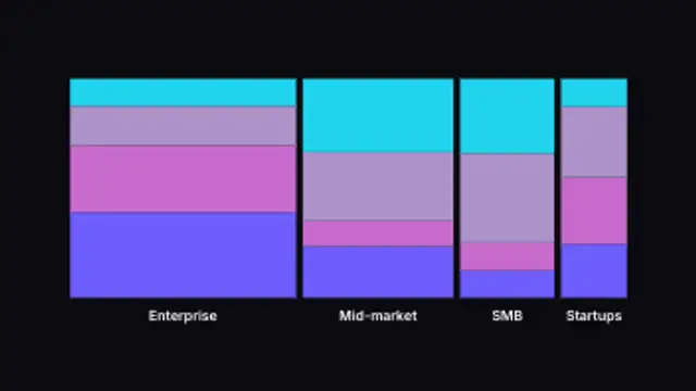
Variable-width columns rise and stack into segments, showing size and composition at once. Type your own category sizes.
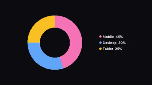
A donut chart sweeps around slice by slice while the legend fills in with computed percentages.
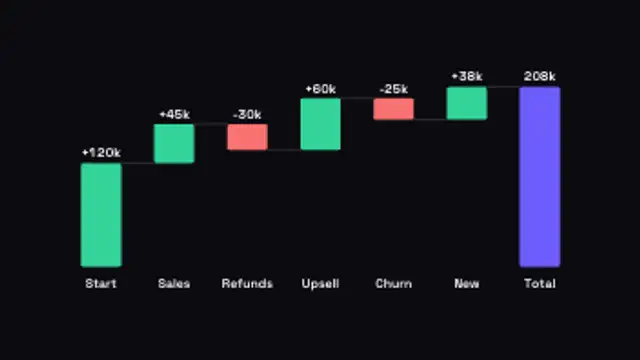
Floating bars step up and down from a running total, with connectors and a final total. Type your own +/- changes.
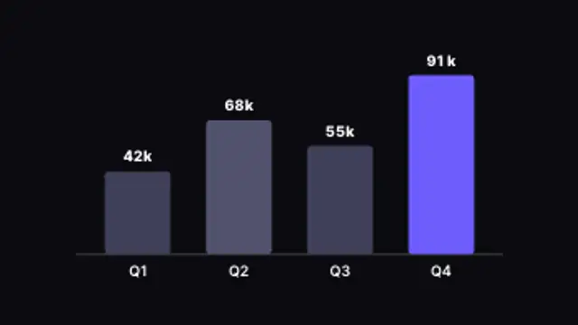
Columns rise one by one with live counting values and the top performer highlighted. Type your own data.
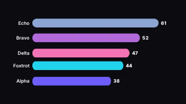
Ranked bars grow and overtake each other as the values climb, with live counting totals. Type your own data.
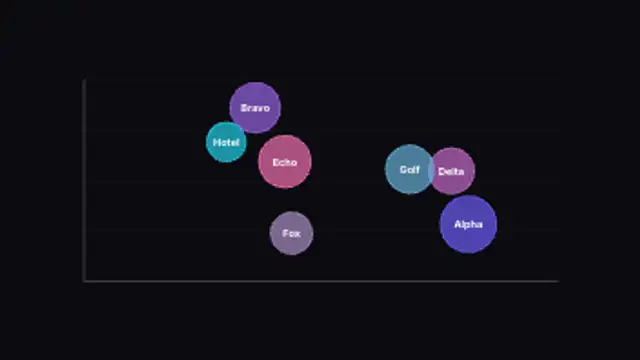
Bubbles sized by value pop onto an x/y plane for three-variable comparison. Type your own values and labels.
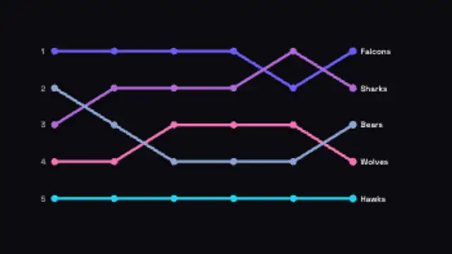
Ranked lines weave between positions over time, crossing as they overtake each other. Type your own entries.