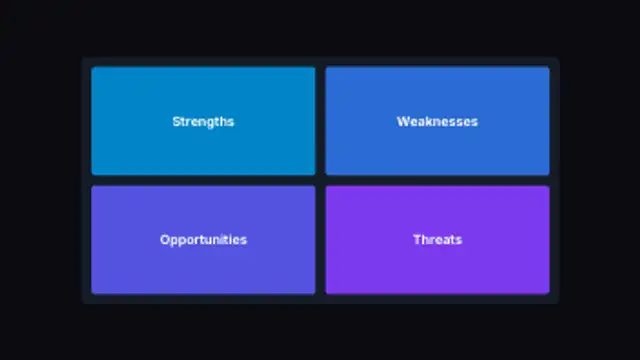
Four quadrants fill in turn on a single board, each panel sizing itself to the grid rather than to a fixed template.
Venn Overlap Reveal
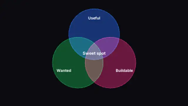
Sets travel in from apart and settle into a true overlap, the shared region brightening where the circles actually intersect.
Slide two or three sets into a real overlap and light up the shared region. Edit labels, overlap amount, fill and colours.
Part of Diagrams & Process. New to this kind of graphic? Read How to Make an Animated Flowchart or Org Chart Video.
Transparent exports and editor imports are explained in the transparent video guide, and every download is free under the commercial license.
Content: title and labels. Typography: font, weight and size. Style: background, text color, primary, secondary, accent and thickness. Layout: aspect ratio and corner radius. Motion: duration and easing.
Venn Overlap Reveal runs 5 seconds by default, and you can set any length up to 30 seconds before you export. It plays once.
Venn Overlap Reveal is useful when an argument rests on an intersection, such as a product that is useful, buildable and wanted, or a job that matches skill and interest. The shared region lights up last, giving the conclusion its own beat.
Four quadrants fill in turn on a single board, each panel sizing itself to the grid rather than to a fixed template.
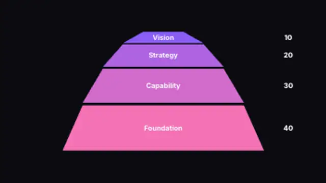
Tiers stack into a pyramid with each band's depth set by its own number, so the base carries real weight instead of being drawn equal.
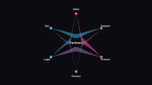
Parties sit around a circle and curved bands link them, each band widening with the weight of the relationship it carries.
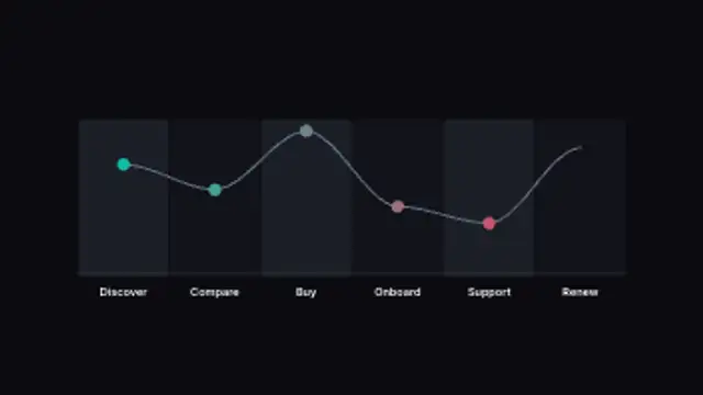
Stages divide the frame into columns and a sentiment line rides across them, rising and dipping to the scores you set per stage.
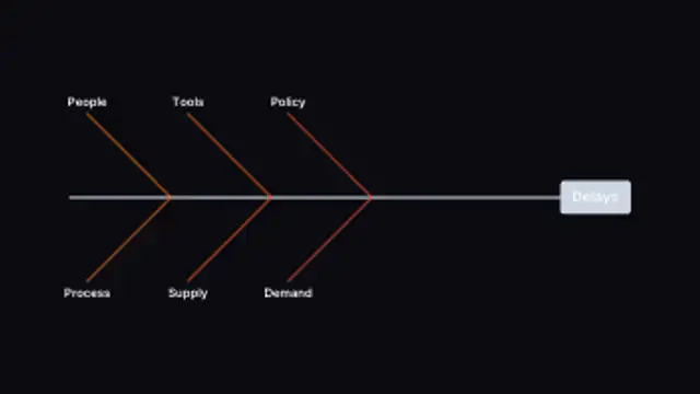
Causes angle off a central spine toward the problem at the head, and the bones respace themselves however many causes you list.
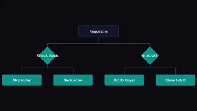
A process branches down the frame, turning every branching step into a decision diamond and routing each connector around it.
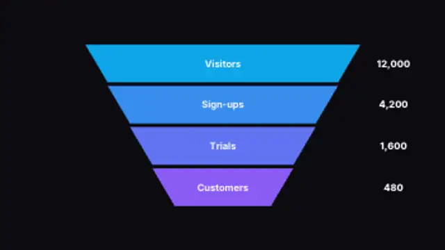
Stages taper down the frame and land one after another, each carrying its own figure so the drop-off reads at a glance.
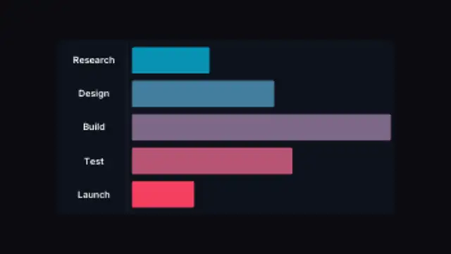
Task bars grow from a shared start line to lengths set by your own numbers, so the schedule draws itself from the data.