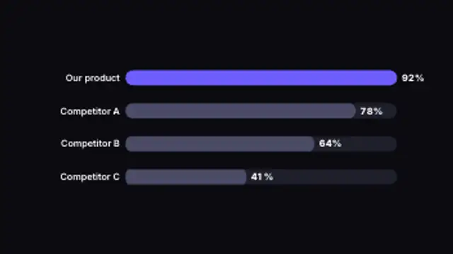
Horizontal bars race to their values side by side, making rankings and comparisons instantly clear.
Slope Chart
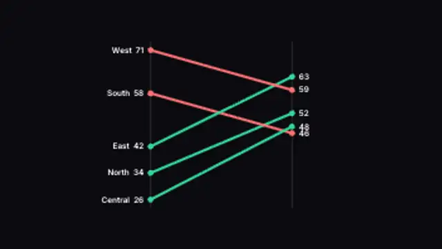
Lines tilt between a before and after axis, colored by whether each item rose or fell. Type your own paired values.
Animate a slope chart where lines tilt between a before and after axis, colored by rise or fall. Edit your paired values.
Part of Animated Infographics. New to this kind of graphic? Read How to Animate a Chart for a Video.
Transparent exports and editor imports are explained in the transparent video guide, and every download is free under the commercial license.
Content: values, labels, suffix and competitor values. Typography: font. Style: background, text color, primary, secondary and accent. Layout: aspect ratio. Motion: duration and easing.
Slope Chart runs 3 seconds by default, and you can set any length up to 15 seconds before you export. It plays once.
Slope Chart is built for before and after stories: regional sales across two years, survey results from two waves, or rankings pre and post launch. Each line's tilt and color tell you who rose and who fell without anyone reading the numbers.
Horizontal bars race to their values side by side, making rankings and comparisons instantly clear.
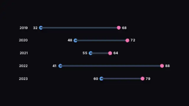
Two dots per row connect with a bar to show the gap between them, growing into place. Type your own paired values.

Ranked bars grow and overtake each other as the values climb, with live counting totals. Type your own data.

Bubbles sized by value pop onto an x/y plane for three-variable comparison. Type your own values and labels.

Two series grow outward from a centered label column for back-to-back comparison. Type your own paired data.

A spider chart sweeps open across its axes and a second series overlays it for side-by-side comparison. Edit the data.

A divider sweeps across a browser window to compare a muted old design with your new one, then settles in the middle with labels.

A comparison divider with a draggable-style handle swings across the frame under Before and After labels.