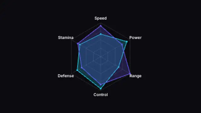
A spider chart sweeps open across its axes and a second series overlays it for side-by-side comparison. Edit the data.
Comparison Bars
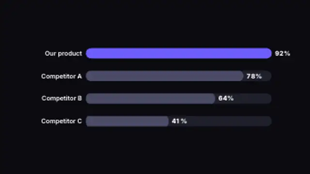
Horizontal bars race to their values side by side, making rankings and comparisons instantly clear.
Part of Animated Infographics. New to this kind of graphic? Read How to Animate a Chart for a Video.
Horizontal bars race to their values side by side, making rankings and comparisons instantly clear. It belongs to the Animated Infographics category on velements, where you edit it in the browser and download it as a finished video file.
Every control in the editor, grouped the same way there. Content: values, labels and suffix. Typography: font. Style: background, text color, primary, secondary and accent. Layout: aspect ratio. Motion: duration and easing. Each change appears in the live preview straight away, and editing is free.
Comparison Bars runs 3 seconds by default, and you can set any length up to 15 seconds before you export. It plays once from start to finish, so it drops straight onto a cut or an opening.
Yes. Set the background to Transparent, then export a PNG sequence for Premiere Pro, After Effects, DaVinci Resolve, Final Cut Pro or Figma: import the first frame as an image sequence and it drops onto a track above your footage with a straight alpha channel. Export WebM with a VP9 alpha channel for the web and for CapCut. MP4 has no alpha channel, so it keeps a solid color or image behind the animation.
Yes. Each download comes with a perpetual commercial license in your name for client work, ads and products, and you may sell the edited clip on stock footage sites. Reselling the preset itself as an editable template is not allowed.
A spider chart sweeps open across its axes and a second series overlays it for side-by-side comparison. Edit the data.
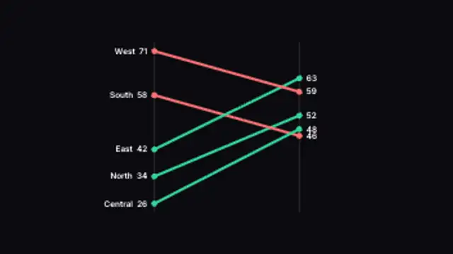
Lines tilt between a before and after axis, colored by whether each item rose or fell. Type your own paired values.
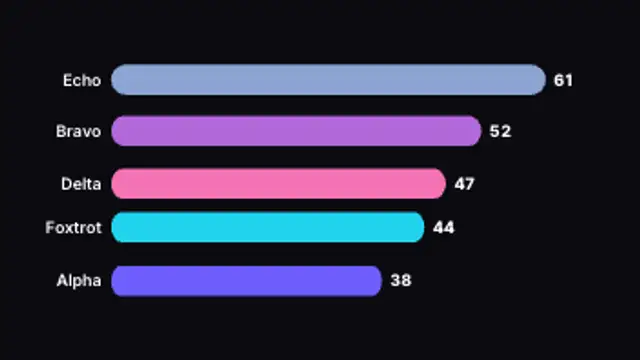
Ranked bars grow and overtake each other as the values climb, with live counting totals. Type your own data.
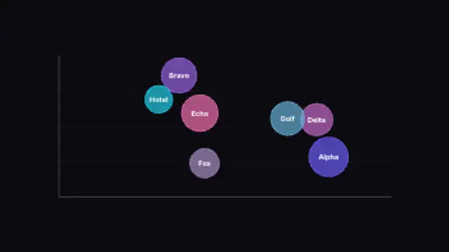
Bubbles sized by value pop onto an x/y plane for three-variable comparison. Type your own values and labels.
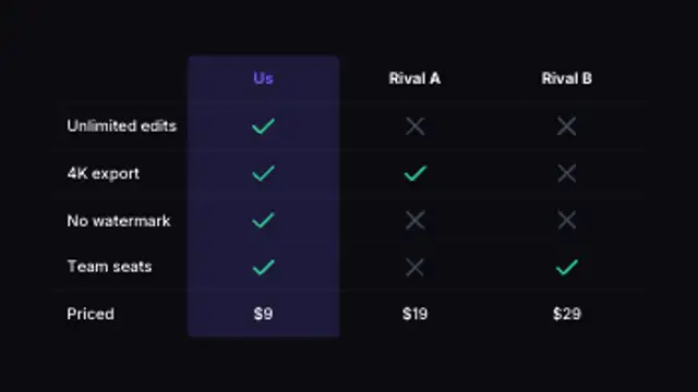
Rows and columns fill in with checks, crosses and values, highlighting the winning column. Type your own cells.
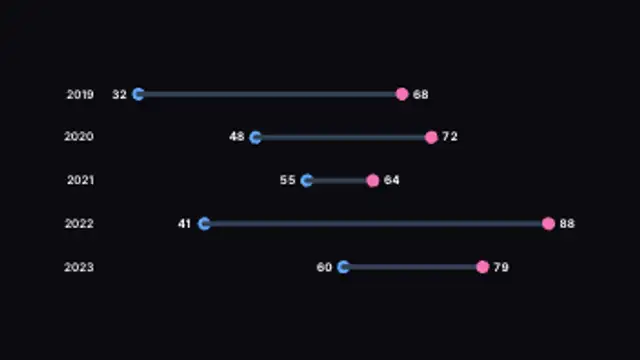
Two dots per row connect with a bar to show the gap between them, growing into place. Type your own paired values.
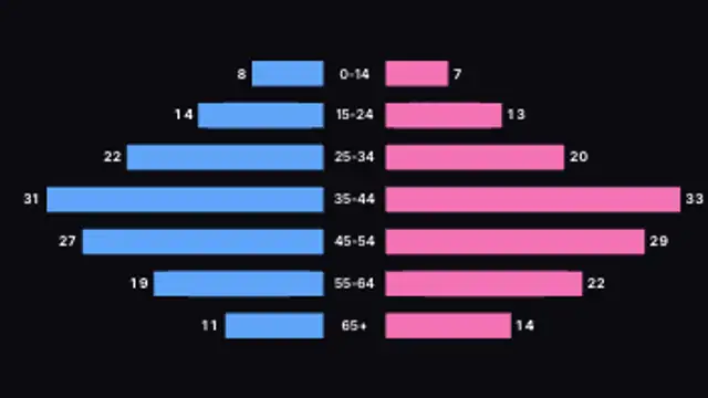
Two series grow outward from a centered label column for back-to-back comparison. Type your own paired data.
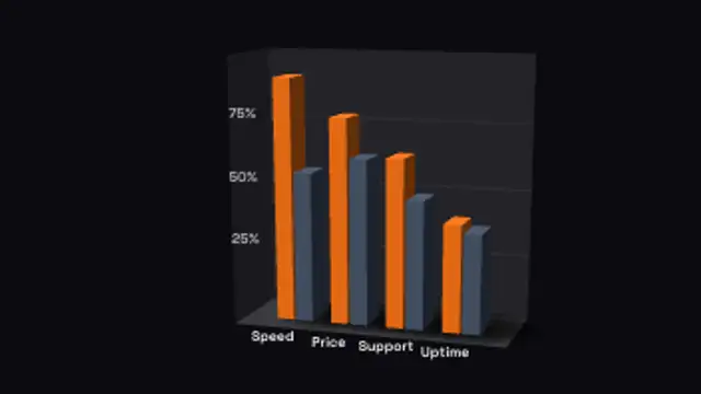
Pairs of bars stand side by side in each slot, built for head-to-head product, team or before-and-after comparisons.