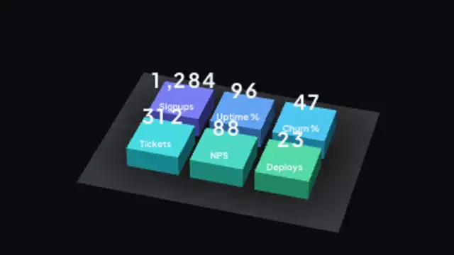
A grid of raised tiles carries the headline numbers, each one counting up over its own label as it lands.
3D Donut Chart Tilt
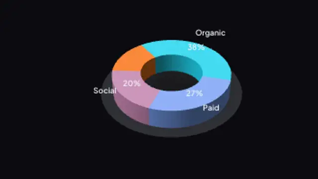
A thick donut ring builds segment by segment, tilted just enough to show its depth without hiding the far side.
Build a tilted 3D donut chart segment by segment with shaded depth and live percentages. Edit values, labels, colors and thickness.
Part of 3D Charts & Data. New to this kind of graphic? Read How to Make a 3D Animated Bar Chart for a Video.
Transparent exports and editor imports are explained in the transparent video guide, and every download is free under the commercial license.
Content: values, labels, prefix, suffix and decimals. Typography: font and weight. Style: background, text color, primary, secondary and accent. Layout: aspect ratio, camera tilt, rotation and scale. Motion: duration and easing.
3D Donut Chart Tilt runs 5 seconds by default, and you can set any length up to 30 seconds before you export. It plays once.
Choose 3D Donut Chart Tilt for channel mix, revenue sources or portfolio allocation in a marketing report or an investor video. The open centre makes it lighter than a pie, and the fixed tilt shows every segment without the chart needing to rotate.
A grid of raised tiles carries the headline numbers, each one counting up over its own label as it lands.
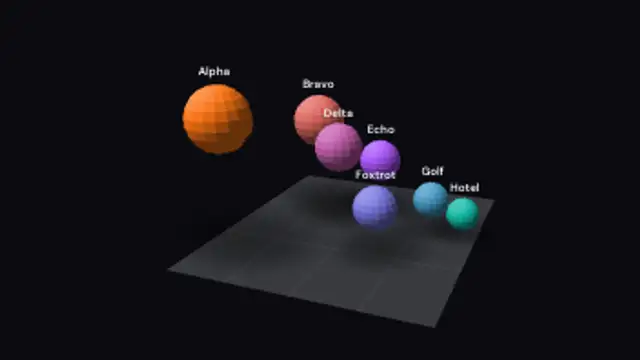
Each sphere grows to its own value so size and height both carry the number, for market maps and weighted comparisons.
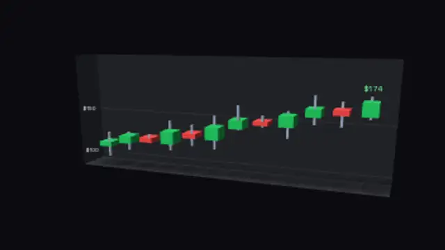
Extruded candles with wicks step across a price wall, opening at the previous close and colouring up or down.
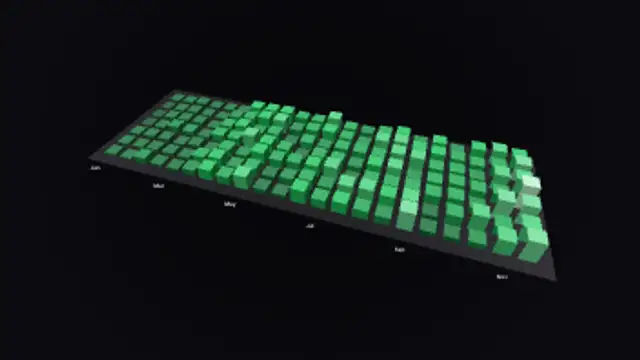
A calendar grid of small towers, taller and brighter on busy days, for streaks, activity logs and yearly recaps.
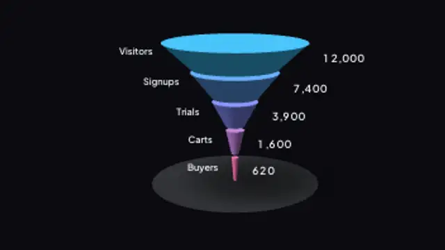
Stacked cone bands taper down from visitors to buyers, each ring sized by its own number and labelled on both sides.

A lattice of cubes breathes in place, each one sized and coloured by its own reading, turning slowly on the spot.

Columns stand off a slowly turning globe at their own coordinates, each one as tall as the number behind it.
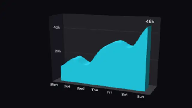
A single trend draws itself across a gridded floor as a solid extruded ribbon, with the running value riding the leading edge.